Orderly Network · Nov 2025 · Staking
Reimagining Orderly's Staking Experience with New Reward System
ROLE
Product Designer
TIMELINE
Oct - Nov 2025
TEAM
1 PM
3 Engineers
2 Designers
SKILLS
Information Architecture
User Flow
Product Thinking
Prototyping
CONTEXT
Adopting a New Approach to Staking Rewards
Orderly Network's staking system is built around $ORDER, the ecosystem's primary token. Users can stake it to earn rewards, creating a loop that incentivizes long-term participation in the network. Orderly's staking portal is where users manage this process — staking tokens, tracking rewards, and claiming earnings. When the team decided to transition from one reward model to another, the staking experience needed to be redesigned to match — not just updating the mechanics, but rethinking how the users interact with them.
FINAL PREVIEW
A new redesigned staking reward model page
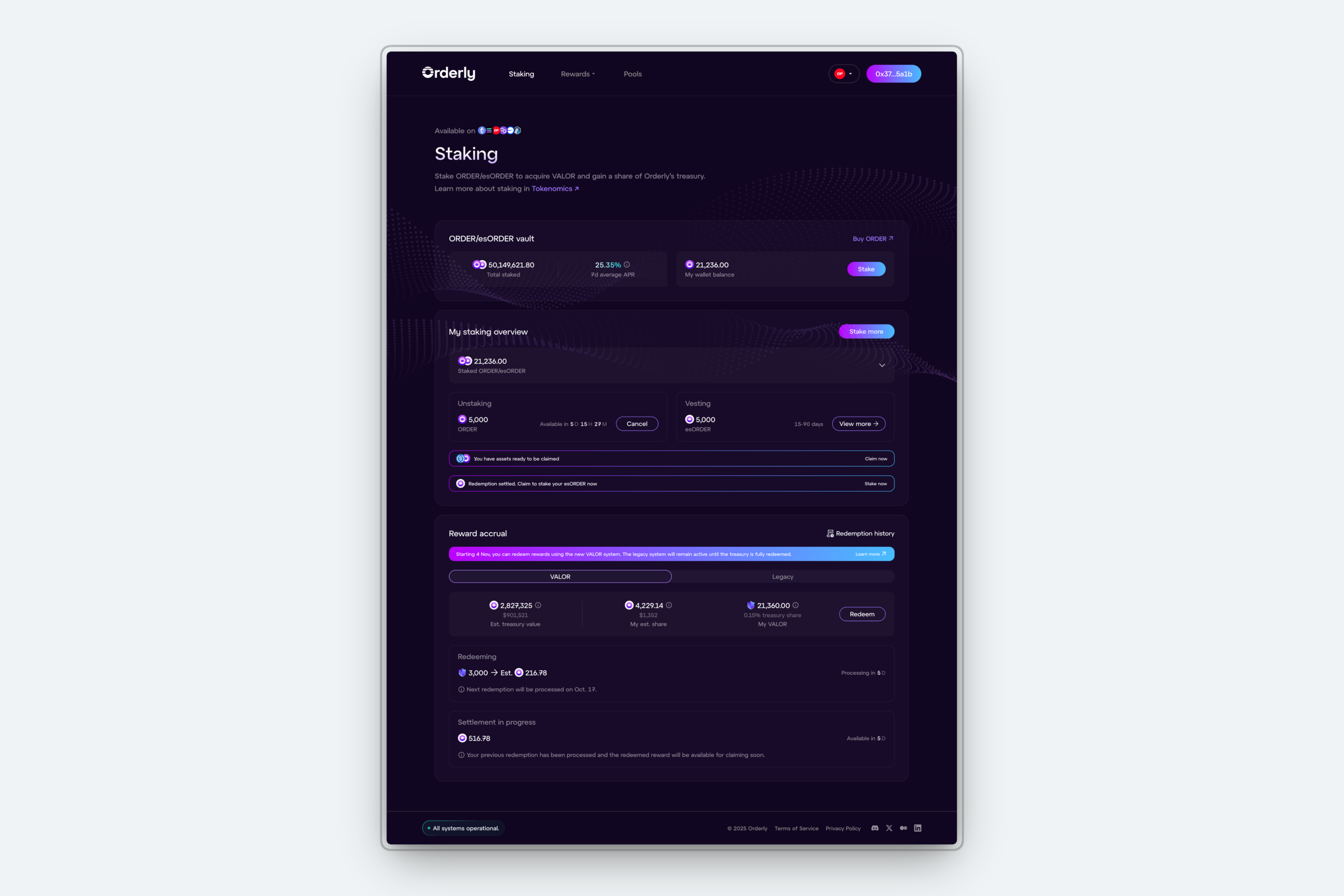
Final staking portal shipped on Nov 2025, with all features available to users after staking.
THE PROBLEM
How might we simplify the user flow to improve staking conversion, despite a more complex reward model?
Despite having a more complex reward model logistics, we aimed to create an even simpler and understable staking experience:
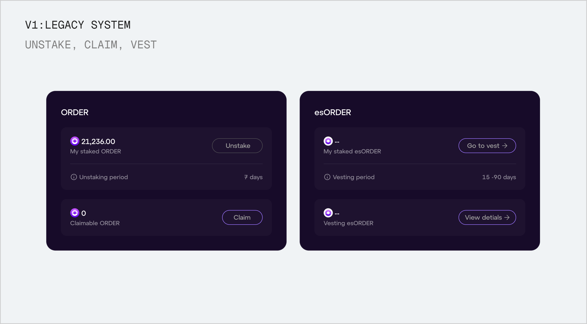
CTAs built for a legacy reward model. Actions like "Go to vest" and "Claim" reflected the legacy system's flow and needed to be rethought for the new staking process entirely.
Legacy flow had flat Information architecture with no clear hierarchy. Staking actions, token balances, and reward details all lived at the same level of hierarchy, giving users no structural cues for how to move through the staking process.
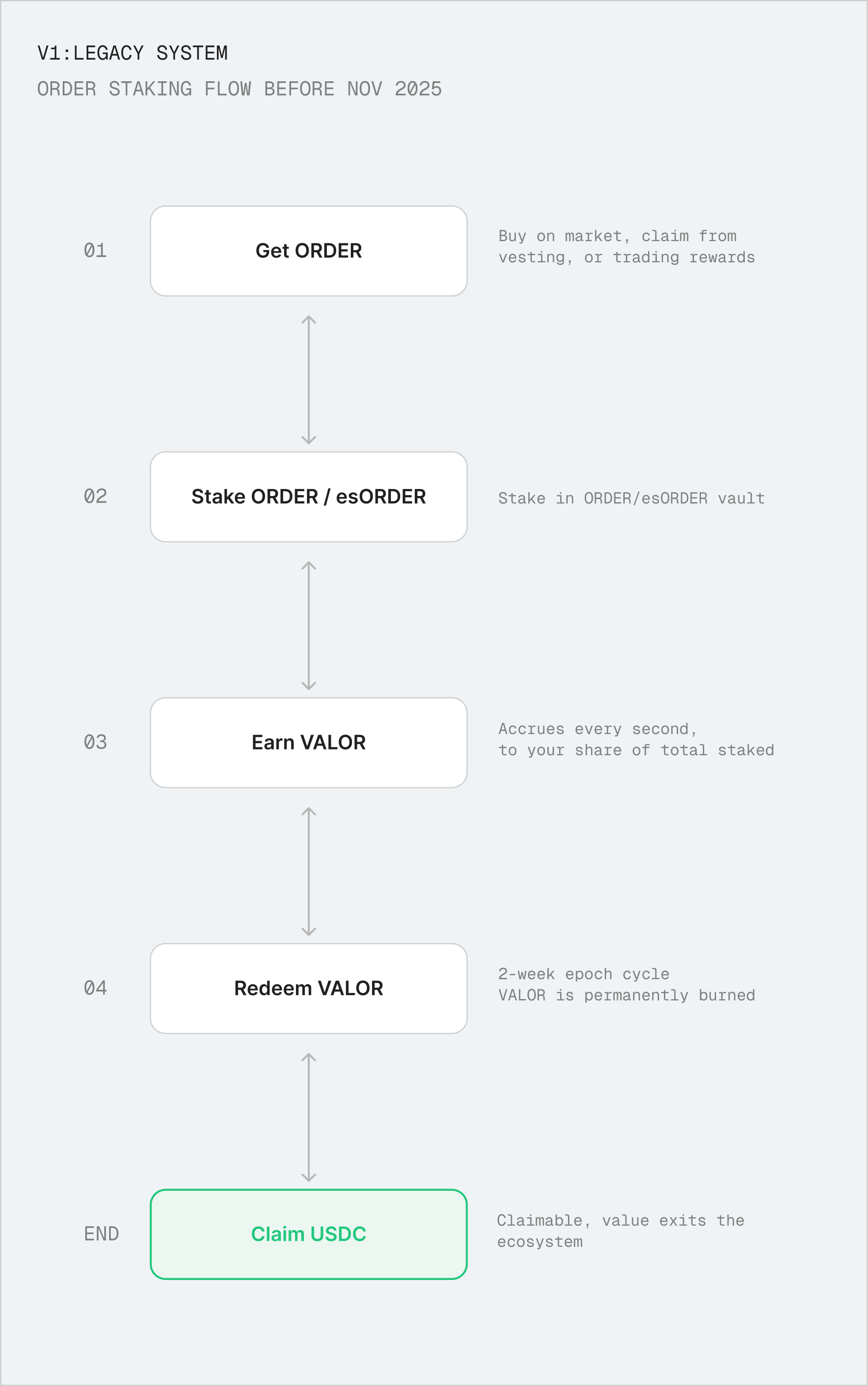
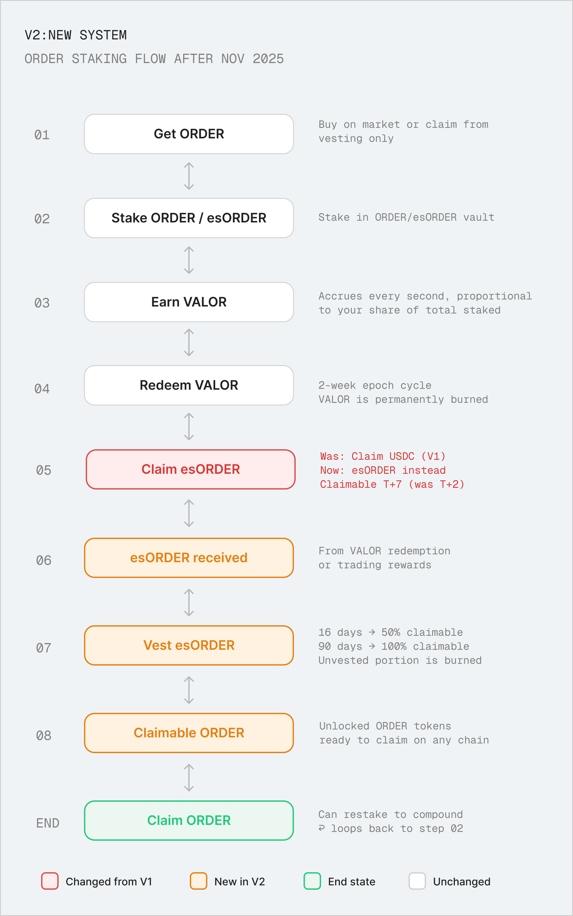
This is a shared reference between myself, the PM, and engineering, mapping the new reward model so we could align on how the redesigned staking flow should work before making any design decisions.
Main logistical difference between legacy and new model:
Legacy: Stake ORDER → earn VALOR → cash out USDC (value leaves)
New: Stake ORDER → earn VALOR → receive esORDER → vest → restake (value loops back)
DESIGN DECISIONS
Adaptive staking overview designed for different use cases
The old design was a display of every possible action at all times, with no clear hierarchy or visual distinction between different types of actions. This made it difficult for users to understand the flow and what to do next.
I thought to approach in a more adaptive way: the staking overview adapts to where the user actually is in their process. For instance, if you haven't unstaked anything, the unstaking section doesn't appear. If you're only vesting, that's all you see. CTAs and content surface only when they're relevant — reducing any confusing information available for each specific use case.
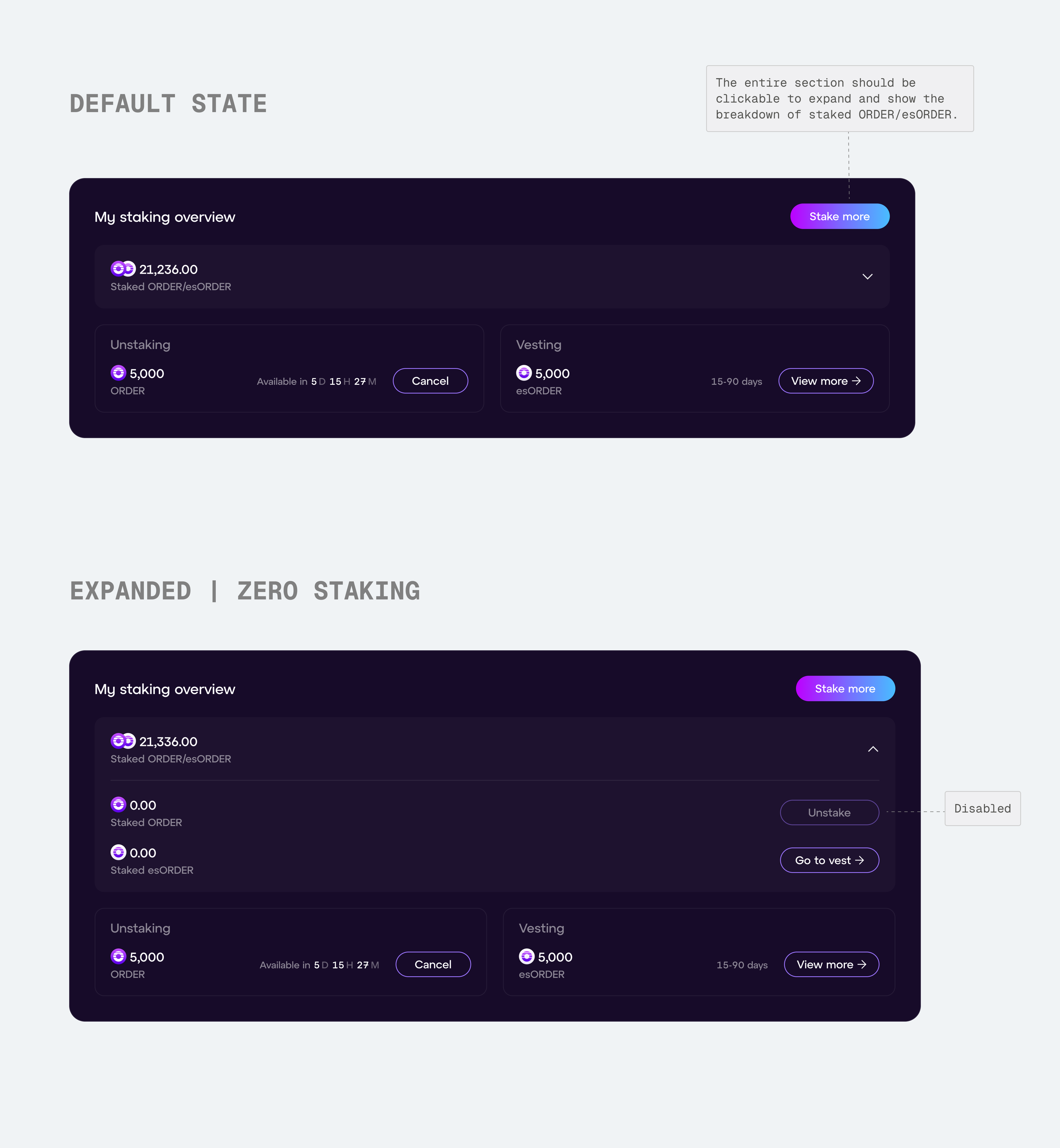
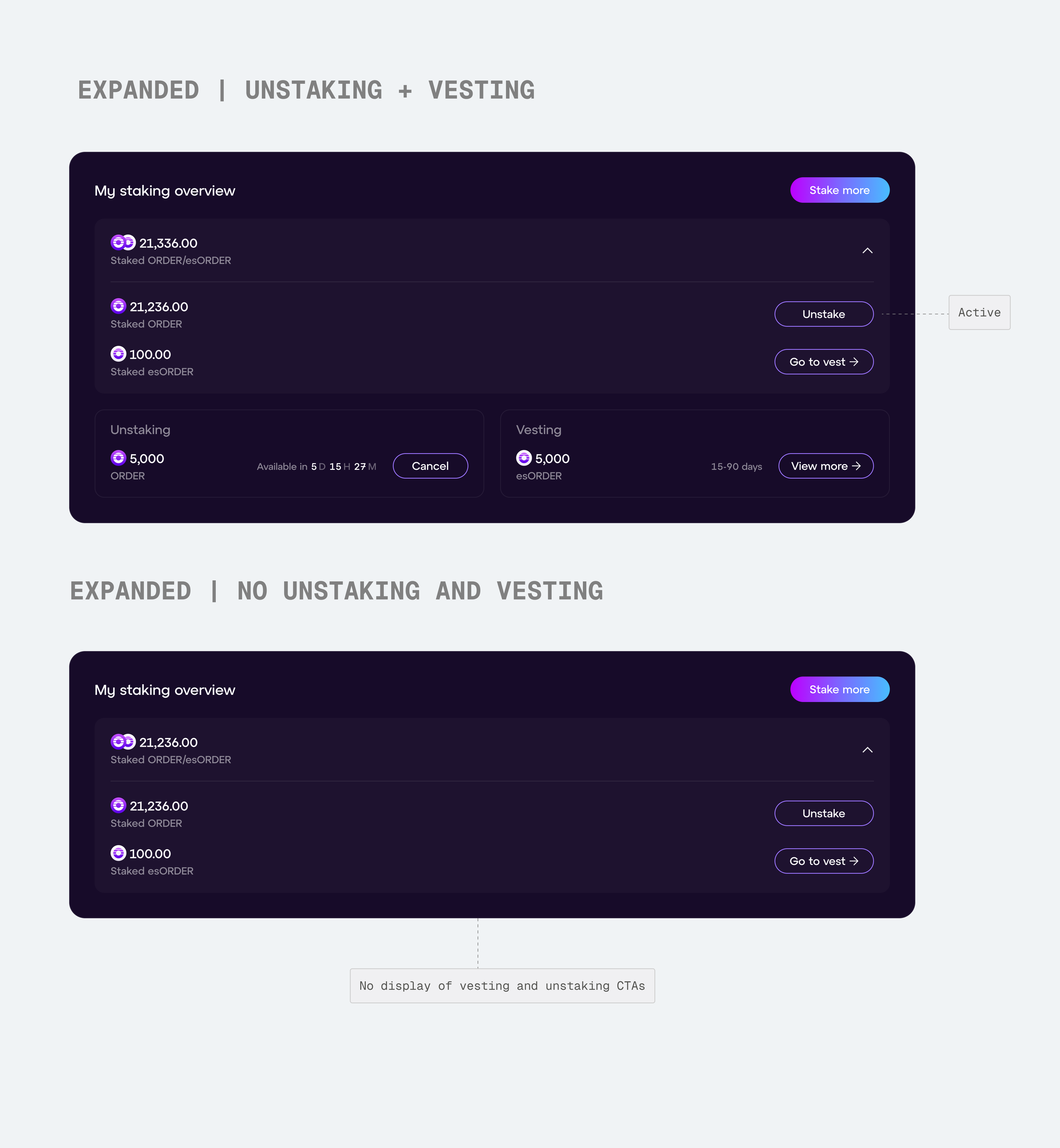
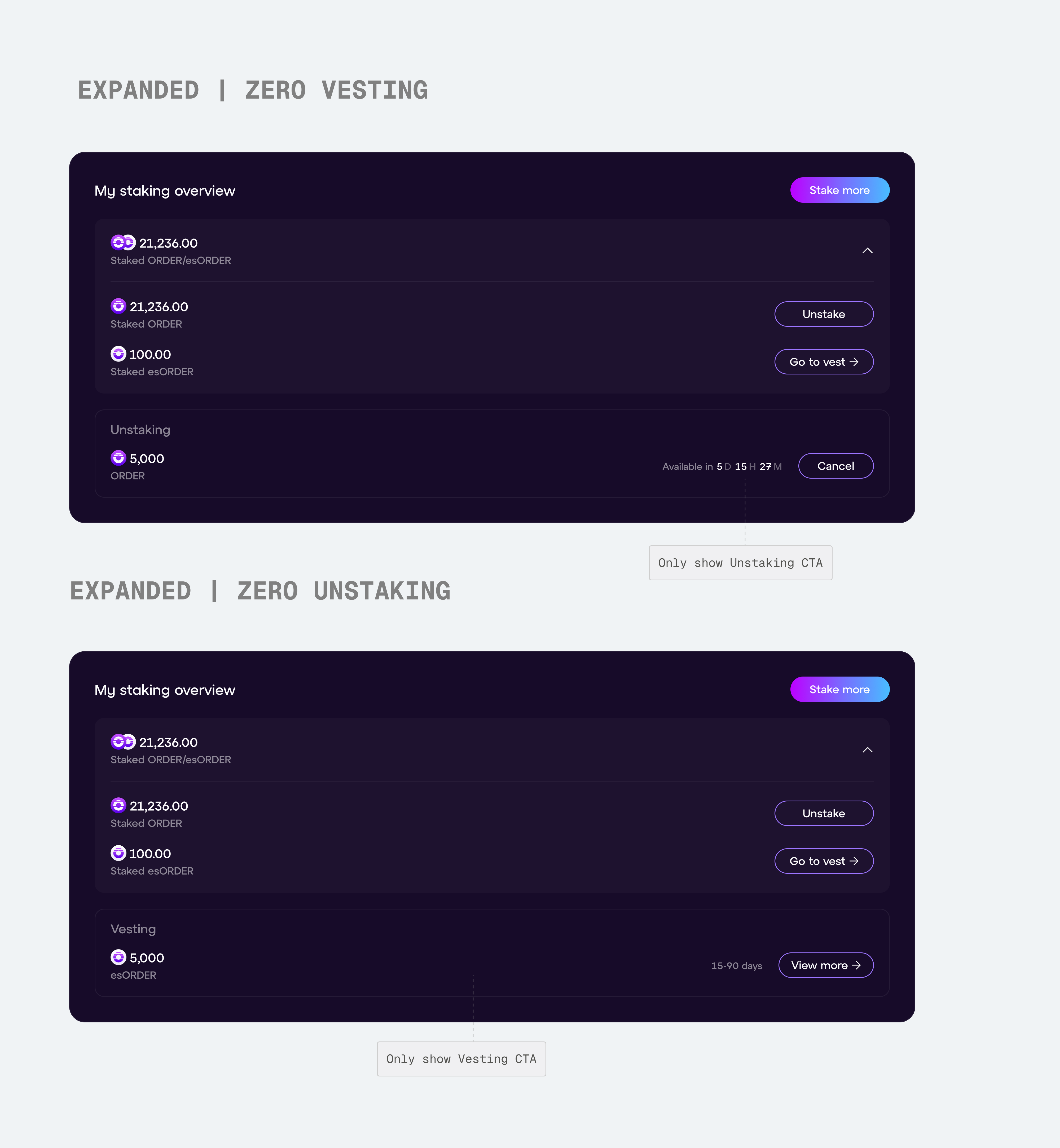
Six states of the staking overview component, each reflecting a different point in the user's staking journey. From default (collapsed) to expanded views showing only the actions and data relevant to that user's current position.
DESIGN DECISIONS
Improving reward accrual for both legacy and new stakers
With legacy VALOR still accruing for existing users, the new design had to accommodate both reward models side by side,without compromising either experience.

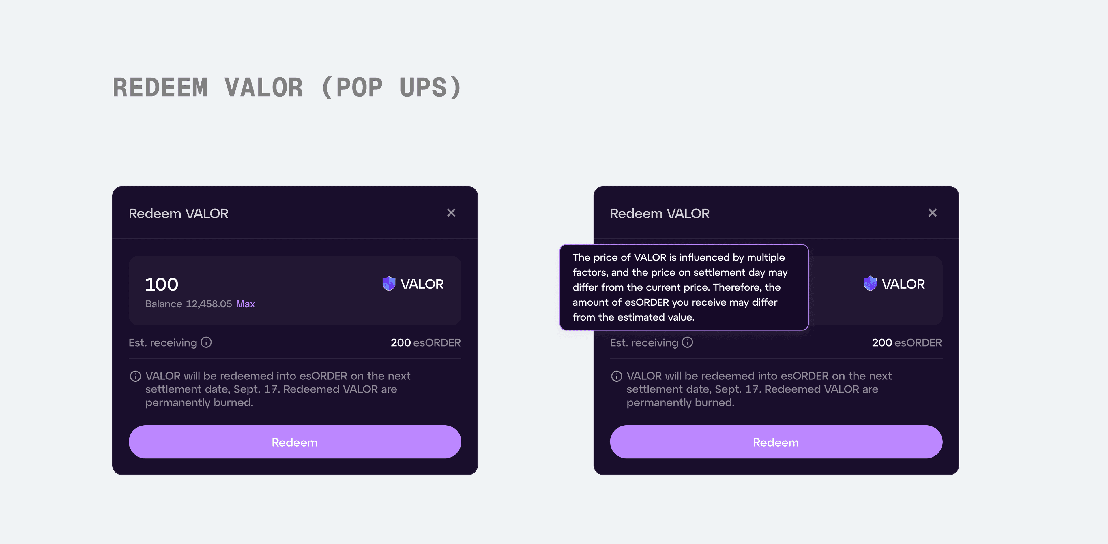
Like the staking overview, the reward accrual section was restructured to reflect the new reward model.


To prevent accidental actions, we added a confirmation modal that appears after the first click on "Redeem", giving users a clear moment to verify before committing.
IMPACT
What went well post-launch
A more intuitive experience: Team and community feedback confirmed the new design felt significantly clearer. Removing unnecessary sections for each user type reduced cognitive load and made staking decisions easier to act on.
Growth in participation: Total staked $ORDER increased significantly after launch, suggesting that a more focused interface meaningfully lowered the barrier to staking.
REFLECTION
Looking Back
Staking was a complex product that took time to fully internalize. Beyond designing the features, I had to understand how each one fit into the staking model, and make sure nothing was missing. This meant constant back-and-forth with PM and engineering to validate that the logic and the design stayed aligned. It was one of the most crypto-heavy projects I've worked on, and it pushed me to engage with product mechanics as deeply as the visual and interaction design itself.
Designing for state, not completeness My instinct was to design for every scenario at once, but the real shift came from asking what the user needs right now. Learning to show less and trust that restraint changed how I approach complex product surfaces.
Information hierarchy is the foundation The biggest wins in this project didn't come from visual polish, they came from restructuring how information was organized.
This is just a snapshot of the entire design process.
Reach out to suoscar2002@gmail.com for the full story!