Orderly Network · Oct 2025
Creating a strategy vault library for Orderly's multi-provider ecosystem
ROLE
Product Designer
TIMELINE
Sept - Oct 2025
TEAM
1 PM
2 Engineers
1 Designer(me)
SKILLS
Product Thinking
Competitive Analysis
Prototyping
CONTEXT
Making Orderly's Vault discovery more accessible
Orderly Network's Strategy Vaults allow liquidity providers to deposit assets into automated trading strategies — a hands-off approach to generating yield. For most of the product's life, there was only one vault: Orderly's own Omnichain vault. With a single option, no selection interface was needed. Traders could only deposit their assets in Omnichain.
That changed when Orderly began allowing external strategy providers to list their own vaults on the platform. What had been a single-vault product became a multi-provider ecosystem. Users had the choice between vaults with different strategies, APYs, TVLs, and SV providers. but Orderly didn't have an existing system to browse, compare, or evaluate them side by side.
My goal was to design a vault discovery library that helps users make correctallocation decisions, clearly communicates the differences between vault types, and scales as new strategy providers continue to onboard.
FINAL PREVIEW
A single page, all inclusive strategy vault dashboard
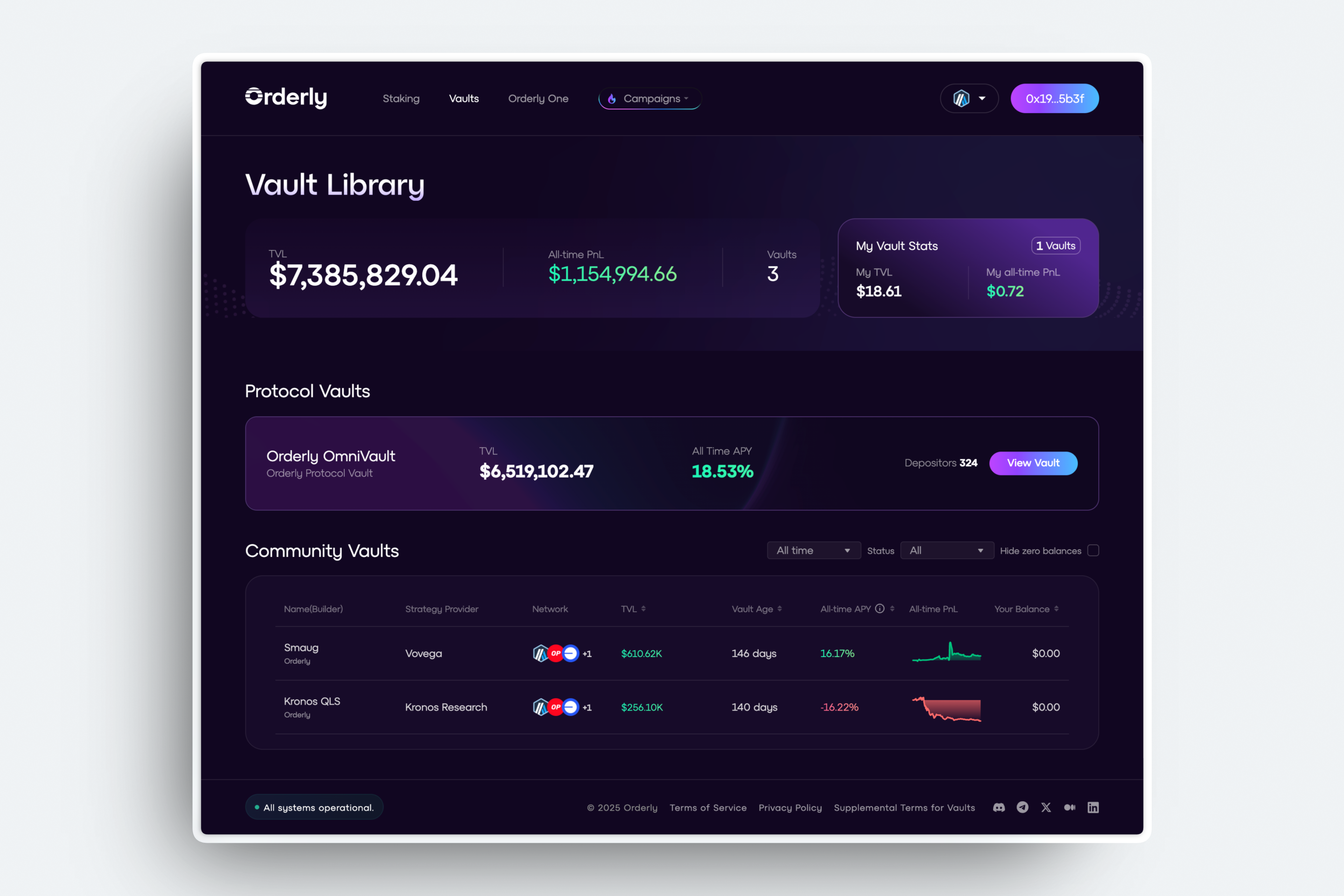
Final dashboard design shipped on Nov 2025, with 1 protocol vault available.
Final Liquidity Provider page shipped on Nov 2025.
THE PROBLEM
Users lack the context to make informed vault decisions
With multiple vaults now live, three core issues emerged:
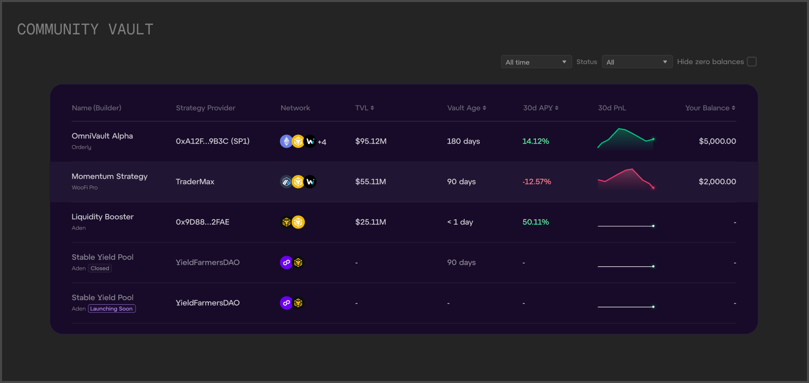
No centralized overview. Vaults existed in isolation with no single place to browse, compare, or filter — users had to navigate to each one individually.
Key metrics buried. Details like APY, TVL, and strategy type weren't surfaced upfront, making it difficult to evaluate a vault without clicking into it.
Blurred user roles. The vault pages treated liquidity providers and strategy providers as the same audience, despite having fundamentally different goals and actions.
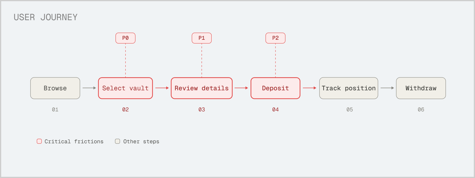
The core friction sits in the decision-making phase — selecting a vault, reviewing its details, and committing capital — where users had no structured way to evaluate their options. All of which could increase drop-off rates.
RESEARCH
How other DeFi platforms organize vault discovery
To understand how comparable platforms handle vault display at scale, I audited six DeFi protocols: Etherfi, Paradex, Drift, APEX, Morpho, and Compound.
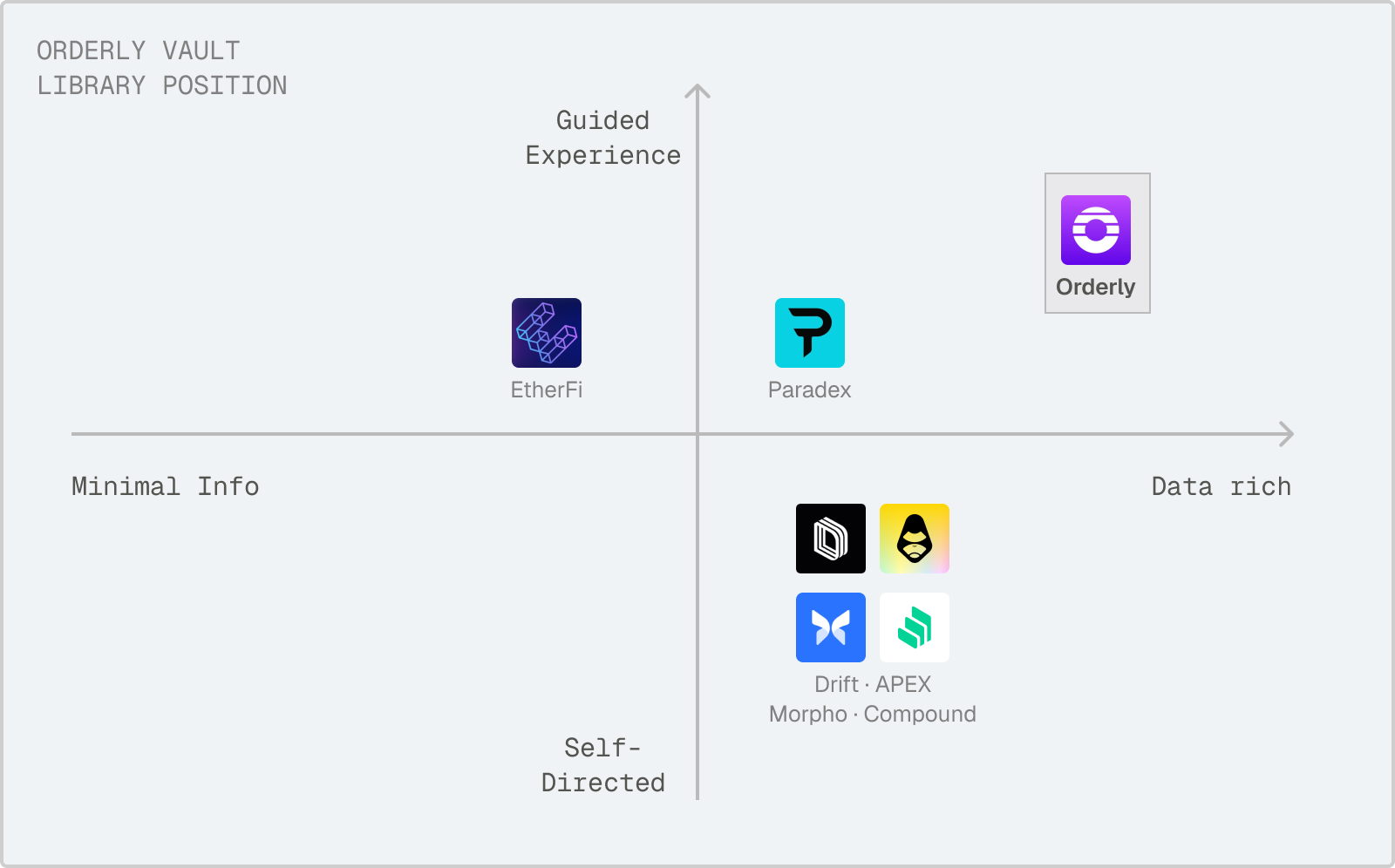
Key takeaway: Most platforms displayed all vaults in a uniform layout — typically a flat table or grid — regardless of who built or manages the strategy. None clearly differentiated between first-party (protocol-managed) and third-party (community-submitted) vaults. This meant users had no visual shorthand for trust level, and had to evaluate every vault from scratch.
This confirmed that a flat, equal-treatment layout wouldn't work for Orderly's use case. With protocol vaults and community vaults carrying fundamentally different trust profiles, the interface needed to communicate that distinction at a glance.
DESIGN STRATEGY
A comprehensive vault library built on trust hierarchy
After aligning with my PM, we established two key principles for the design direction:
1. Protocol vaults and community vaults need distinct visual treatments. Orderly's own vaults are vetted and managed internally. Community vaults require more scrutiny from users before committing capital, so the interface should surface additional context (SP identity, vault age, performance history) to support that evaluation.
2. The format should match the evaluation behavior each vault type demands. Protocol vaults are fewer in numbers, so users need a quick snapshot to feel confident. Community vaults are more numerous and variable, so users need to scan and compare across multiple data points.
This led to the core design decision:
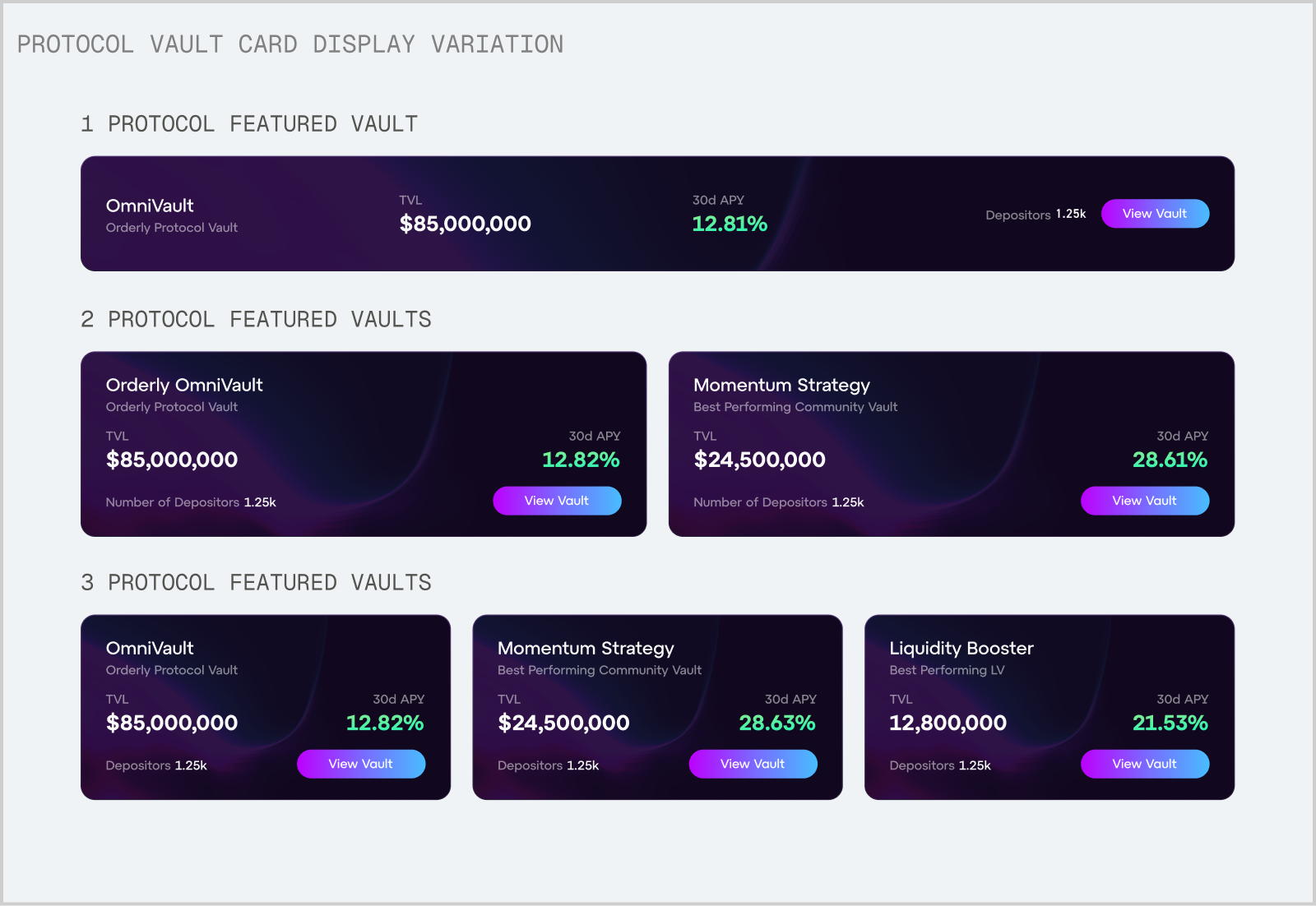
Protocol vaults → Card format
Cards give protocol vaults visual prominence and a curated, trustworthy feel with a stronger CTA. Each card surfaces key metrics (APY, TVL) at a glance. The layout adapts to however many protocol vaults exist at any time.
Community vaults → Table format
Tables enable side-by-side comparison across many vaults, surfacing the additional scrutiny data (vault age, SP name, strategy details) that users need before depositing into a less-vetted option.
EXPLORING DIRECTIONS
Refining Visuals and Information Architecture for UI components
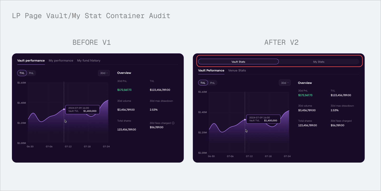
After establishing core design prunciples for the dashboard, I then refined the design choices of certain components in LP/SP pages. Previously, the LP page opened directly into sub-tabs — Vault Performance, My Performance, My Fund History — which mixed vault-level data and personal data in a single flat navigation. Users had no way to quickly separate "how is this vault doing?" from "how am I doing in this vault?"
I introduced a primary segmented control that splits the page into two clear modes: Vault Stats and My Stats, each with its own sub-tabs underneath. This way, prospective depositors evaluating a vault land on vault-level metrics first, while existing depositors can jump straight to their own position — without either user type sifting through data that isn't relevant to them.
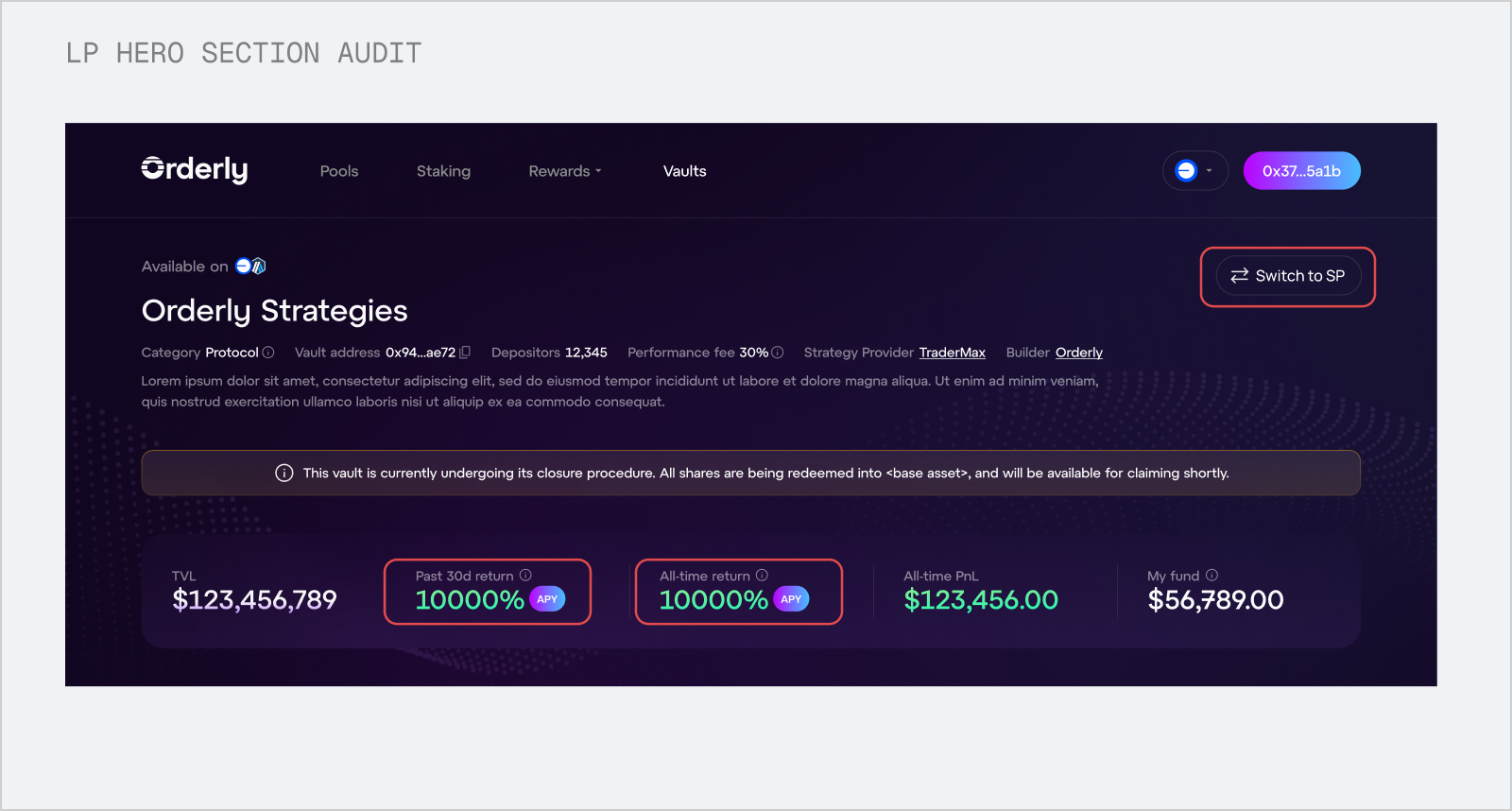
I added a "Switch to SP" toggle for users who operate as both a liquidity provider and a strategy provider, a common scenario where an SP deposits into other vaults, or an LP also manages their own strategy. The toggle only appears when both roles apply, keeping the interface clean for single-role users.
We also introduced an all-time return metric alongside the existing 30-day APY. The 30-day figure alone can be misleading, particularly for newer vaults where a short window of strong performance might not reflect the strategy's actual track record.
IMPACT
What went well post-launch
Within three weeks of launch, total vault TVL grew from $6.5M to $7.7M — a $1.2M increase driven by improved discovery and visibility across the platform. The new dashboard also supported the onboarding of two community vaults, both of which saw steady TVL growth after being listed. Most notably, Smaug Vault recorded a 295% APY over its first 30 days in February, demonstrating the kind of high-performing community strategy that the tiered system was designed to surface.
+18%
Total TVL Growth in 2 Weeks
-15%
Drop Off Rate Decreased
REFLECTION
Designing with users, not just for them.
This was my first time designing within the DeFi vault ecosystem. I came in with limited domain knowledge of how vaults, LPs, and SPs relate to each other , which meant frequent check-ins with my PM to validate my understanding before making design decisions. That process taught me that domain fluency isn't a prerequisite for good design, but investing in it early makes every decision sharper.
Designing with money demands precision. Working directly with financial data raised the stakes on every detail. How a number is formatted from abbreviated vs. full value, decimal places, percentage vs. absolute, isn't a style choice, it's a trust decision.
Design systems extend beyond UI components. Collaborating with back-end engineers to define metric display standards showed me that systematic thinking applies to data presentation just as much as to buttons and layouts.
If I had more time, I would have pushed for direct research with traders and strategy providers to validate our assumptions with real user feedback.
This is just a snapshot of the entire design process.
Reach out to suoscar2002@gmail.com for the full story!